Wallet Monitor is an expense tracking app with a difference. Mostly expense tracking apps focus on details, as in, detailed account of everyday spend, detailed account of the items you’ve spent them on and so on. However, Wallet Monitor has more of an approximation approach. I believe that such an approach will be more helpful as people mostly don’t follow the strict schedule of entering their spending details in the app each day.
Wallet Monitor allows the user to enter spending information for each day along with the item they spent it on. However, the approximation feature kicks in, in that the user can choose to enter some default values on some items for each day/each weekday/each day of the weekend. Suppose the user knows he spends around Rs 100 on travel each day. He can enter that information in the default section and then he doesn’t have to enter the same Rs 100 each day. Suppose he spends an extra 200 bucks on travel each day of weekend, he can add 200 as default for weekend. So the total default for each day of weekend will be 100 + 200 = 300 on travel.
This will save the user from the daily qualms of entering data. Also Wallet Monitor shows the spend data for the last 2 months only. This will allow the user to track his more recent spending trend and not be concerned about old trends. Wallet Monitor does not ask for information on bank accounts or any information on cards. The user has the option to enter his monthly income though.
A more detailed description is as follows:-
The ‘Enter Spends!’ button takes the user to the screen where he enters his spending details.
2. The ‘View Spending Data’ button takes the user to the ‘Spending Data’ screen.
A-Here in the ‘By Date’ segment, the user sees the calendar for the last 2 months, wherein clicking a cell shows him his spend details for that date. He can also add data for an earlier date by using the ‘+’ button. The ‘Exclude Defaults’ switch allows the user to see his spending without the defaults he has set.
B-The ‘By Category’ segment shows all the items the user has spent on. Selecting an item gives details of amount spent on that item and some comparisons.
3. The ‘Preferences’ button takes the user to the ‘Preferences’ page.
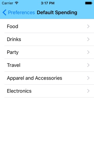
A- The ‘Set Defaults’ option takes the user to the list of items or categories of spending. Selection one of them takes the user to a detail page, where he can enter default amounts he thinks he spends on those items each day/each weekday/each day of weekend.
B-The ‘Notification Time’ option takes the user to a detail page where he can set a time when he will be reminded to share his spendings each day.
C-The ‘Spend Category Editing’ option takes the user to a page with a list of categories or items he has added. He can add more categories of spending or delete existing categories.
D-The ‘Delete Data’ option allows the user to delete all his earlier spending data and reset the date to start from the current date. It does not delete default data.
E-The ‘Delete Defaults’ options allows the user to delete all the data he had entered earlier in the ‘Set Defaults’ option.
F-The ‘Monthly Earnings’ option allows the user to enter his monthly earning if he wants, for comparison with spending data.
G-The ‘Warning Limit’ option allows the user to set a warning limit for a day. If his spending in a day exceed the warning limit, the cell for that date will be shown in light red in the ‘By Date’ segment of the ‘Spending Data’ screen.
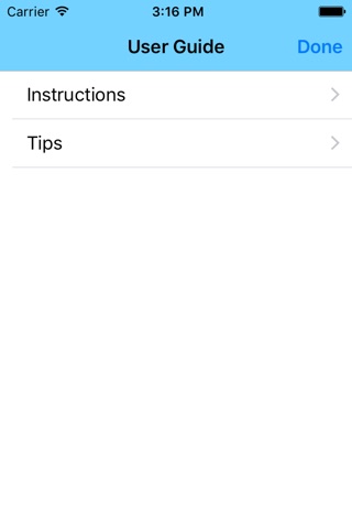
4. The ‘User Guide’ button takes the user to the user guide screen from where he can view ‘Instructions’ for and ‘Tips’ on using the app.


